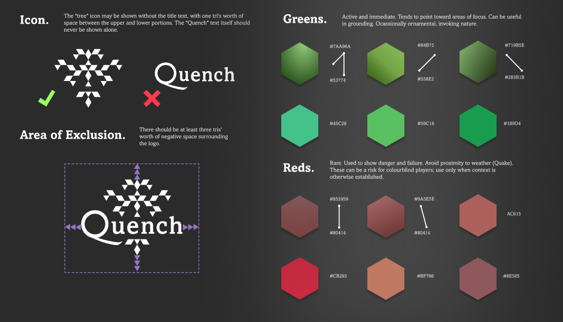
Quench is a videogame for PC and Nintendo Switch™. For approximately 2 years I worked on visual style and interface, solved UX problems, built branding connecting game and marketing, among many other tasks. When I came onto the project, the gameplay itself and its 3D art pipelines were reasonably mature, but the UI needed a total overhaul. We started with a deep dive into typography and dialogue modal styles, and went from there. We built visual systems from the inside out, using an atomic-style design process, testing as we want.
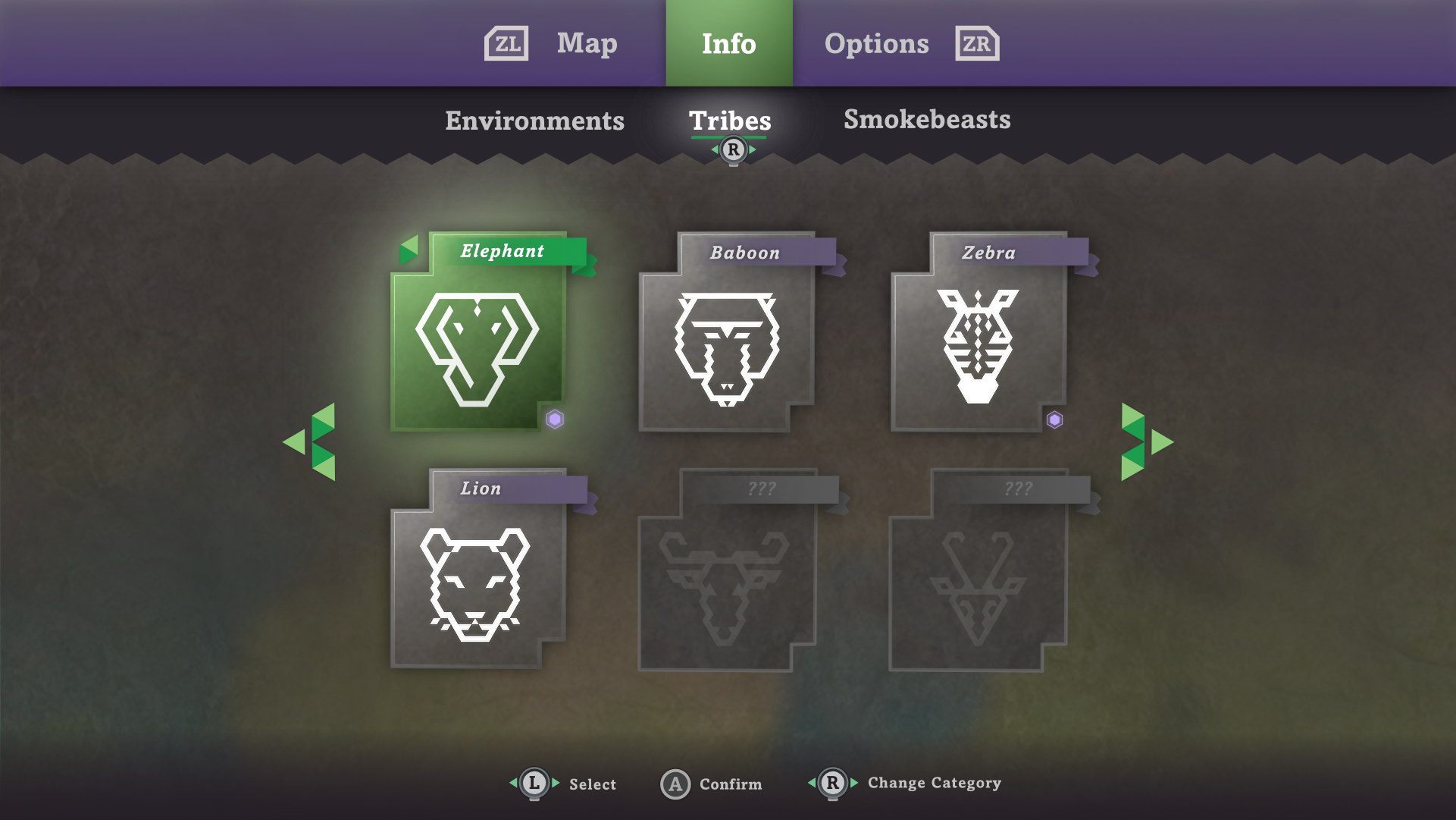
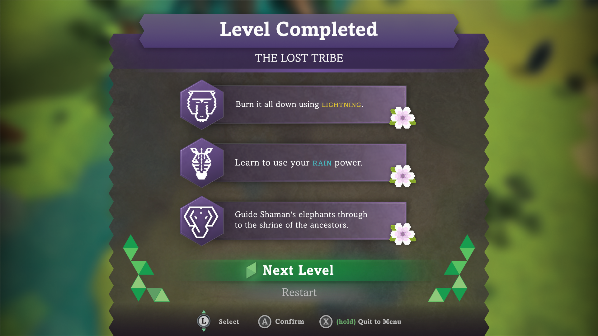
Above: A Nintendo Switch interface depicting the info screen and its various points of visual heirarchy: indicators for new information, selection and unlock states, content filtering, and more.
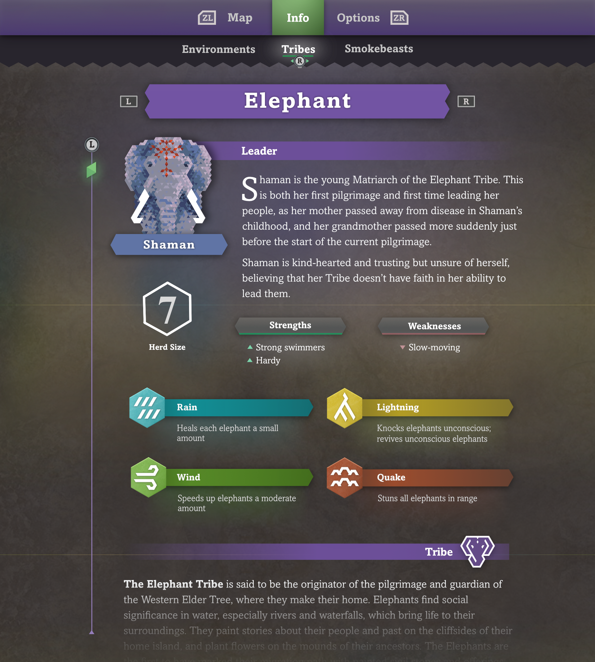
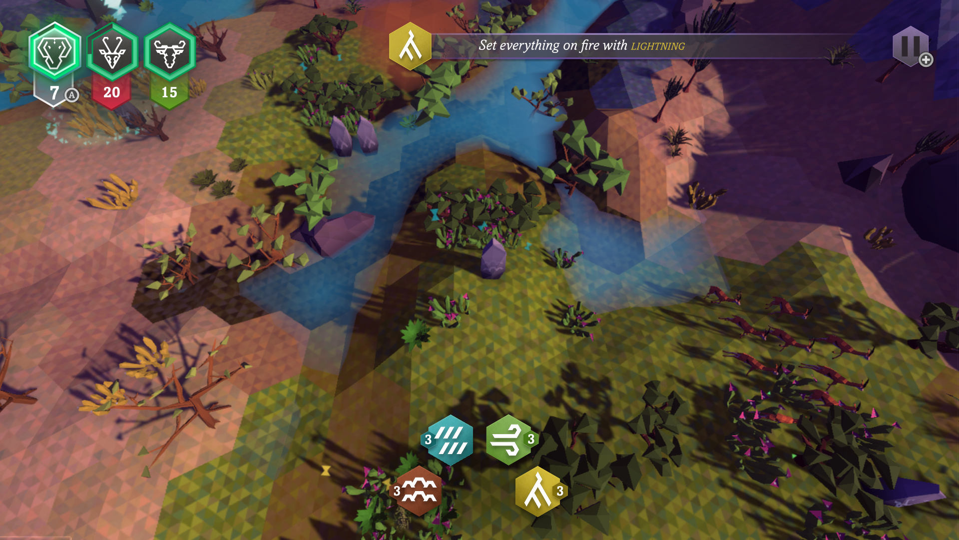
Direction and details. The direction of the Quench UI was dictated by two primary principles: first, to have a subtle physicality (shadows, lighting, depth) to underline the papercraft/origami qualities of the game, which supports the game's hex and tri-based visuals. Second, to bring in organic textures that evoke wood, stone, and paper. Look for playful semantics between info-purple and action-green!
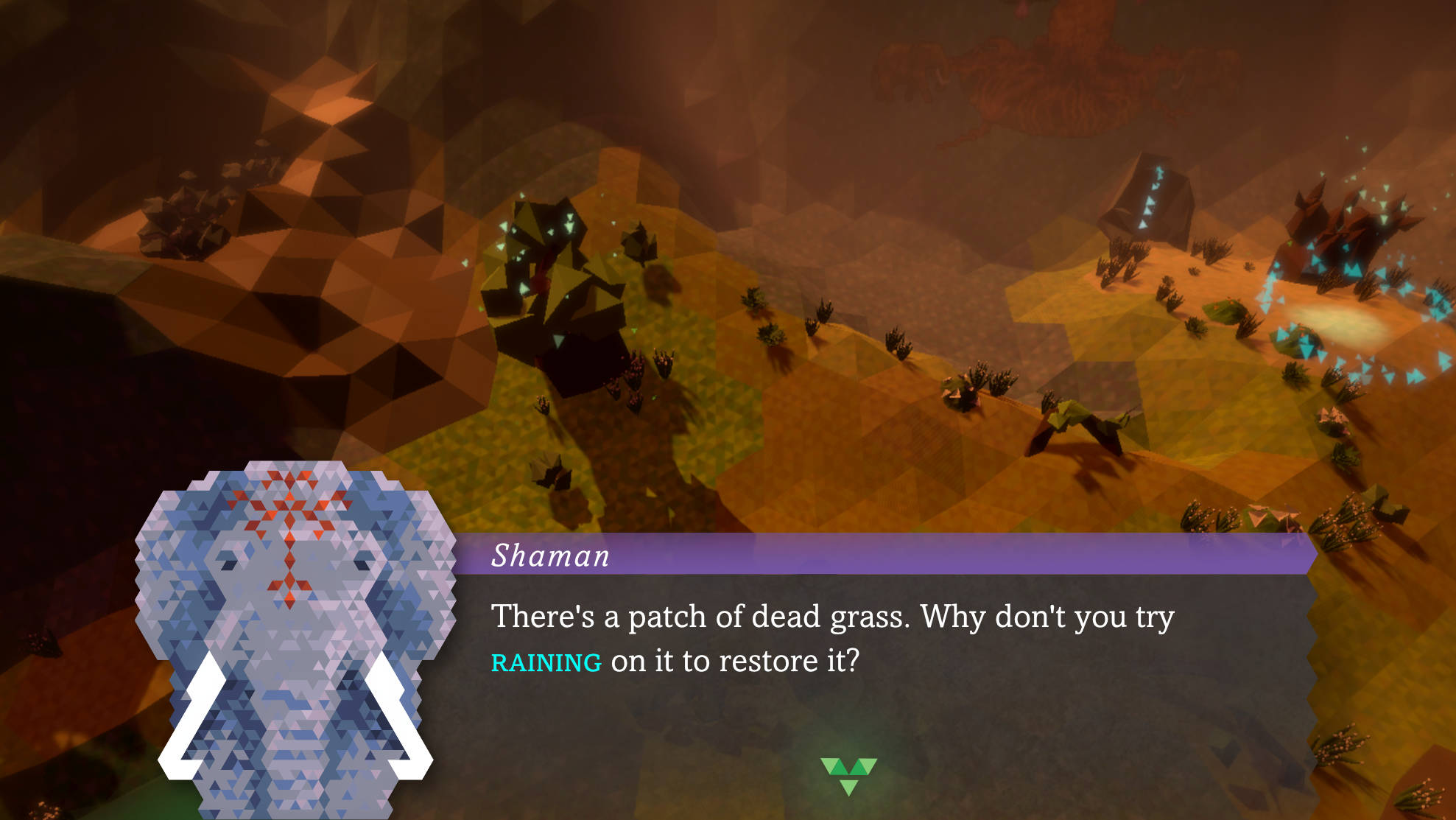
Accessibility. Big fonts, input legends wherever possible, clear visual hierarchies, a non-reliance on explicit color, and lots of other points of accessible design are baked right in from the start. When possible, we tried to keep the game design itself accessible by letting notifications linger during periods not requiring input, letting players access goals at any time, allowing for multiple play inputs (controller, joycon, touch, etc.), and lots of other details.
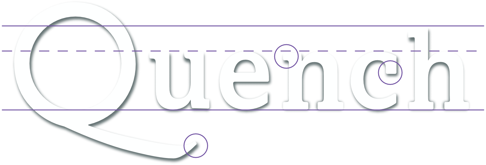
Custom Typography. The Quench font was purpose-built to provide a look and feel for the brand that we weren't able to find on the market. It draws heavily from old-style fonts, especially Caslon (as in the long tail of the Q), but blends humanist and even geometric features into the core design, such as the circular aperture of the capital O. "Like a modern storybook." The Q, luckily, also looks like an elephant and their trunk, which we always had to keep in mind when visually balancing marketing materials.
Nate Davis
UX + UI Designer & Artist
Hire me! Feel free to reach out via email.